
Former Liverpool star Jamie Carragher has called upon his club to revert back to their 'proper badge'.
The Merseyside outfit have been making several changes to their online and digital presence in recent months, with the club opting to 'make its global branding clearer' by further embracing the historic Liver Bird emblem on its online logos.
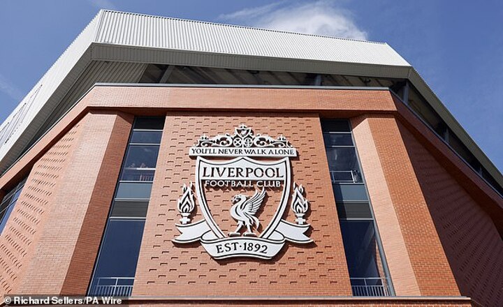
The club has slowly moved away from its previous crest, which featured a shield design and a depiction of the Shankly Gates.
But ahead of tonight's Champions League draw, Carragher stated that he wasn't a fan of how the club's new crest looked when lined up next to logos of clubs from around Europe.
It came after several other Liverpool fans had questioned the change on X (formerly Twitter), with one asking: 'Which Crest should represent our club?'
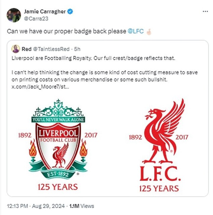
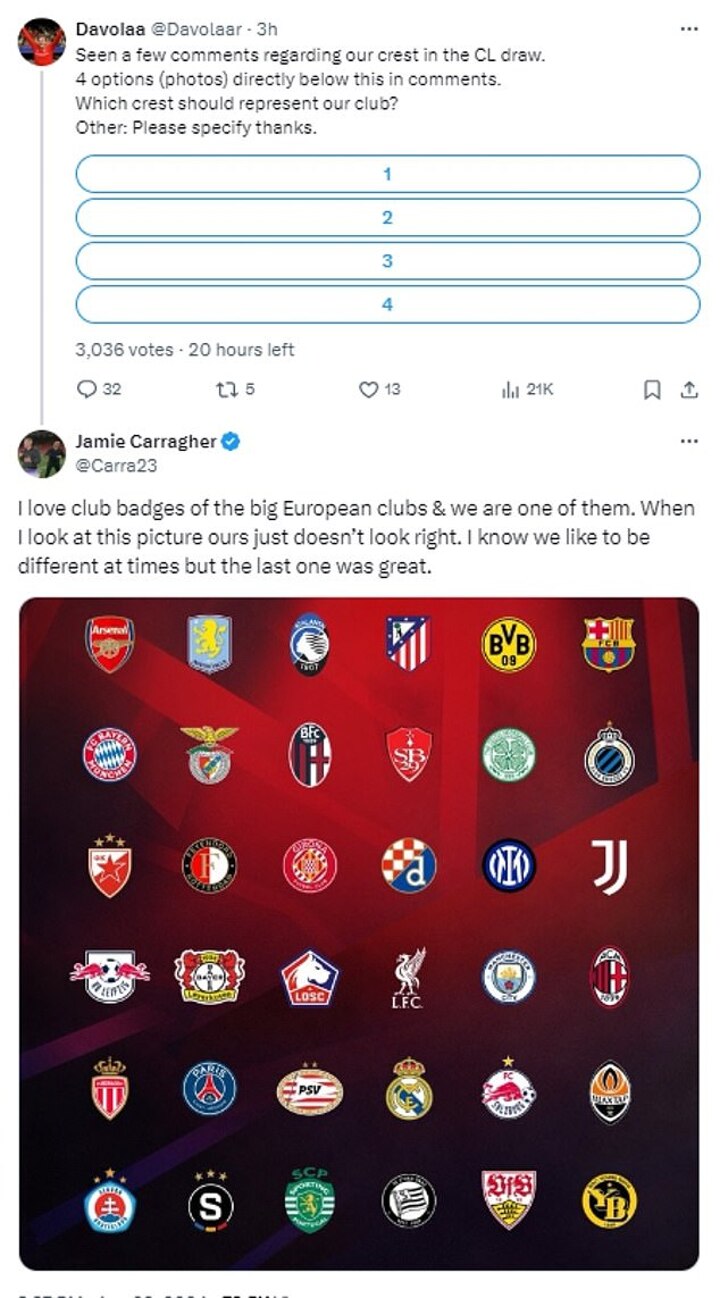
Carragher replied, saying: 'I love club badges of the big European clubs and we are one of them. When I look at this picture ours just doesn’t look right.
'I know we like to be different at times but the last one was great.'
He would go on to issue a message to the club's official account, writing: 'Can we have our proper badge back please @LFC.'
Liverpool have not used the shield logo on their kits since they opted to use the Liver Bird logo during the 2012-13 season, paying homage to the badge used on kits during the 1950s.
It was first worn on Liverpool's kit for the 1950 FA Cup final, where Liverpool lost to Arsenal.
Despite that, the club had still used the previous crest on merchandise, branding around Anfield and on its digital platforms, with the club saying that the crest will continue to be used in non-digital areas.
'LFC’s crest will remain as the club’s official emblem and an integral part of the club’s brand identity, and will continue to be used in non-digital areas – including at Anfield, the AXA Training Centre, AXA Melwood Training Centre and club offices,' Liverpool said in a statement in June.
The club added: 'Supporters should see the Liver Bird start being introduced on digital and TV platforms during the build-up to the 2024-25 Premier League season.'
Other Liverpool fans have been voicing their opinions on the change on X, with several agreeing with Carragher.
One wrote: 'I’m glad someone picked up on the matter, as it’s doing my head in. It looks off - the og one looks much better.
'Minimalism isn’t always better, especially with football crests. We should use it for internal comm/corporate/premium stuff, but not all online presence @LFC.'
But some didn't agree, arguing that the new badge looked better.
'The Liver Bird is the proper badge,' one wrote, while another added: 'It’s all about the bird Carra the crest is only 32 years old the bird [has] been around since the 50s.'
'I love ya buddy but you’re dead wrong about this. Also, the crest hasn’t gone anywhere, it’s just being used in places that are more suitable. The Liverbird on its own looks great on the shirt,' one added.