
If you can spot the four differences in Feyenoord's new badge, you should take your sharp eye to MI5.
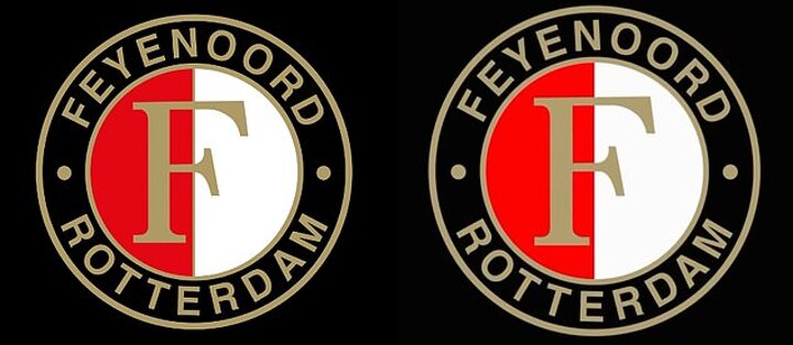
The Dutch club have been mocked on social media after revealing a 'fresh' new logo which appears almost identical to their old one.
Just weeks after Arne Slot left the Rotterdam-based club for Liverpool, they are trying to turn a page - but fans have joked the designer needs a 'raise' for the virtually imperceptible adjustments.
Feyenoord last changed their badge in 2009 and it is one of the most recognisable in the Netherlands.
'Graphic Designer: That will be €1million,' quipped one fan on X, formerly Twitter.


'Give that designer a raise,' another said.
'Someone was consulted, met with, and paid for months to come up with this. Unreal,' one wrote, thought Mail Sport has not independently verified their speculation.
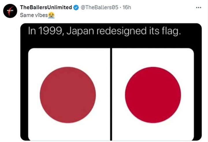
Others said it had the 'same vibes' as Japan's infamous flag change of 1999, which saw the disc change slightly in colour and position.
'Please lecture me when you see the change because I’m not seeing anything here,' another commented.
Well, Mail Sport is happy to provide that lecture as we can take you through the four miniscule changes which have been made.
Firstly, the words at the top and bottom of the badge, 'Feyenoord Rotterdam,' have seen their letters bunched a bit closer together.
Secondly, the red section in the left half of the circle has been made slightly brighter.
Thirdly, the letter 'F' at the heart of the badge has been upsized and been bumped to the right to make it more central.

Finally, the golden border between the red and white sections has been removed.
The new badge will not be on shirts in the coming season but will be introduced in the 2025-26 campaign, the club have confirmed.
While fans have jested about the microscopic changes, at least Feyenoord are not being torn apart for ruining their badge under the scrutiny of the public.
Clubs have faced the heat in recent years for switching their badges to theoretically more 'social-media friendly' designs.
For example, Juventus replaced their traditional crest with a 'J' in 2017 and were mocked for it being 'tragic', 'disgusting' and 'like an A-level art student's personal brand mark'.