
When England dropped their new kit for this year’s World Cup last month, the design split opinion amongst fans. Some were all for the touch of Euro 96 blue in the home strip, while others thought the shoulder fade ‘looked nothing like an England kit’.

However, the away number - an Italia 90 homage - seems to have got the full backing of the Three Lions fanbase.
Whether either outfit will earn a place in the pantheon of classic World Cup kits remains to be seen, because there is some tough competition. The tournament has been the stage for some of the most iconic strips in football history over the years, thanks to a mix of unique designs and achievements made while wearing them.
From Brazil's famous yellow and blue, to England’s 1966 winning number and the height of creative craziness of the '90s, World Cup kits have a special place in every football fan’s heart. Sportsmail counts down the ten best strips of all time – and it’s not an easy choice.

10. Peru - 1978 World Cup
Their legacy may be limited to five tournaments, yet Peru's place in World Cup folklore lives on in one simple sash. There’s something about a sash across a football shirt that gets most fans gooey-eyed and that all stems from the stylish output from the South Americans across the 1970 and 1978 tournaments.
The sash first appeared on a Peru shirt at the 1936 Olympics, but was perfected in the 1970s after adidas became the country’s kit supplier for the Argentina showpiece - and they created an all-time classic.
The bold red strip across a clean white jersey was already a standout number, but in '78 they added a big polo shirt collar and the brand’s famous three strips on the shorts and socks for a truly timeless look.
It’s a kit Scotland fans will remember well, as the Peruvians beat the Tartan Army on their way to topping the first group stage. However, fellow South Americans Brazil and Argentina proved a step too far for Peru in the second group phase, as they shipped in nine goals against the pair without reply. But at least they looked good in doing so.

9. Nigeria - 2018 World Cup
African teams have had their fair share of highlights on the World Cup kit front – Cameroon’s 1990 creation can count itself unlucky not to have made this list – but it’s Nigeria who have often been the continent’s kit kings.
There’s a great deal of fondness for their away kit at USA 94, a shirt synonymous with the image of Rashidi Yekini celebrating his goal against Bulgaria wrapped around the goal net, but it's the more modern-day version that even surpassed that design. The 2018 Nike shirt gave a subtle nod to the jersey that made headlines in the States, while also turning up the volume a little bit more.
The bright ‘eagle-wing’ design across the shoulders in black and white, and vibrant green pattern across the torso, made it an eye-catcher in Russia and hugely popular with fans. So much so, it had three million pre-orders before its release and shoppers even queued outside Nike’s flagship London store to try and get their hands on the shirt. The only downside was the lack of appearances it had at the Russia tournament, where Nigeria managed only one win during the group stage and were unable to progress to the knockout rounds.

8. Holland - 1974 World Cup
Holland always seem to make orange look good and there’s been some utter era-defining outfits over the years – the Euro 88 shirt is possibly the greatest example – but when it comes to World Cups, they’ve never looked as good as in 1974.
The deep orange jersey twinned with bold black trimmings made the Netherlands stand head and shoulders above the rest in Germany that year, and is one of three shirts they have worn in tournament finals. The cherry on top of this adidas kit was the badge, which matched the singular black shorts and stripes, but also covered almost the whole of one corner of the chest. The country’s national animal never looked prouder to be part of the football team’s kits.
It was a look that accompanied Holland all the way to the final, where they eventually came up short against the hosts. Interestingly, the team’s star and football icon Johan Cruyff famously wore a different version of the shirt, removing one of adidas’ well-known stripes down to his lucrative sponsorship deal with rival sports brand Puma.

7. Croatia - 1998 World Cup
There aren’t many clubs or countries who can say that the signature design of their kit is completely unique, but it’s a statement Croatia can boast comfortably. It was Euro 96 when the country's red and white check pattern first made an impression on football fans and it's one that has stayed as a huge favourite ever since.
Two years on from that tournament, Croatia made their World Cup bow while donning a shirt that would take its place among the best ever seen at the finals. Moving the design on from 1996, Lotto slightly simplified the look by having the pattern appear on just one shoulder – almost as if the Croatian flag had been draped around its neck.
To finish it off, the polo collar was given a trim of red and blue to match the colours of the country's flag. It was a kit that inspired a nation, as Croatia, led by its first real ‘golden generation’, finished third in the tournament with striker Davor Suker scooping the Golden Boot. Lotto doubled up too, with the blue away kit twinned with checkerboard side panels serving as one of the finals' best change strips.

6. France - 1998 World Cup
For all the stylish looks France had in the 1980s, it was the shirt they wore on home soil towards the end of the 1990s that proved to be a winner in every sense of the word. Before France 98, fans had constantly harked back to the glory days of Michel Platini and Co, who claimed victory at Euro 84 while wearing one of the country's most popular shirts.
Therefore, adidas’ move to pay tribute to that very design for the 1998 World Cup was a masterstroke. The 90s version included a bold red stripe and three additional white stripes down the centre of the shirt, but modernised (for the time) with red piping and a clean white collar, a look which was completed by a dash of the colours of the Tricolour.
The design may well have galvanised Aime Jacquet’s side, because in the end it inspired France’s first ever World Cup win; with Zinedine Zidane’s two headed goals in the Paris final overshadowing the pre-match drama surrounding Brazil's Ronaldo and sealing their finest triumph. The red stripe has since made further appearances on the France home shirt, but it’s yet to follow in the same glory as the '98 edition and its original inspiration.

5. Denmark - 1986 World Cup
There are few better partnerships in football than Hummel and the Danish football team. The hook-up is one of the main reasons fans of English clubs have been pleased to see the brand back in the Premier League and it all comes back to this kit from the 1986 World Cup.
The Mexican sun already made the finals one of the hottest on record, but it didn’t stop the Danish shirt from lighting up the tournament with a design that has become a Hummel trademark. Splitting the shirt into two halves, each section was made up of subtle pinstripes in contrasting red and white designs, with one side almost resembling Christmas candy canes. On the pitch it was worn by a Michael Laudrup-led Denmark who topped their group after beating Scotland, West Germany and Uruguay while donning the strip, before they were knocked out by Spain in the last 16.
And the iconic design lived on, with Hummel recreating it for the 1987-88 kits of Southampton, Aston Villa and Coventry during their first foray into the English market. Meanwhile, Denmark strips continue to be made by the brand – forgetting the dalliance the Danes had with adidas – and have made headlines ahead of next month's Qatar showpiece by embossing the badge and logo on their latest kits in protest at the country’s poor human rights record.

4. Brazil - 1970 World Cup
Yellow shirts, green trim, blue shorts. It’s a timeless look, an iconic look and every generation has their favourite Brazil kit. Whether it’s the 2002 mega stars that brought the World Cup trophy home from Japan and South Korea in the best example of Nike’s templated design of the time, the 1994 Umbro classic which shined in the USA or 1982’s polo stunner for ‘greatest team to never win the World Cup’, Brazil’s kit history is like no other.
Yet, there is something ever so simple and elegant about the football icons that strutted their stuff in Mexico at the 1970 World Cup. Carlos Alberto, Jairzinho, Rivellino and Pele are just some of the names that donned the round-necked classic made by Athlea International, where the yellow and blue seemed brighter and bolder than any that followed - despite the grainy images of 1970s technology.
It saw the South Americans defeat every team that stood in their way on route to winning the World Cup, and subsequently keeping the Jules Rimet trophy. Apt that arguably the best-ever side to win the World Cup did it wearing the greatest kit the country has ever worn.


3. England - 1990 World Cup
England have always saved their best kits for the World Cup. There’s no doubting the significance of the 1966 winning red shirt, while the 1982 Admiral strip has long been lauded by England fans as one of their best-ever designs. However, when it comes to the ‘cool’ factor, England have never looked more so than at the 1990 World Cup.
Italia 90 was the setting for a wind of change in English football and along with Gazza, World in Motion and David Platt came the kit that knitted it all together. Umbro produced a design featuring an embossed pattern throughout a white shirt that was pure 1990s, which included a smart polo collar with additional stripes and a button added to the base, along with a unique trim to the cuffs that topped off England’s best-ever look.
Even in 2021 fans could be seen sporting these shirts in pubs up and down the country, whether the original or one of the many retro remakes created since. It obviously helped that the look went hand-in-hand with England’s run to the semi-finals in 1990, when the country fell back in love with the game, but it doesn’t take anything away from the design itself. It’s no wonder Nike have gone back to Italia 90 as inspiration for England's latest away number.


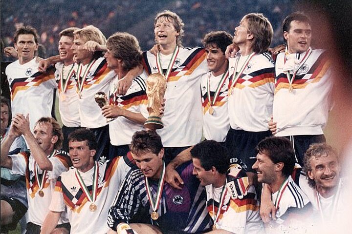
2. Germany - 1990 World Cup
A kit that changed German international shirts forever and is often regarded as not just the best World Cup jersey of all time, but the game's numero uno when it comes to football kits. Before 1988, Germany kits had been a pretty basic white and black colour scheme. That was until designer Ina Franzmann and the team at adidas were tasked with creating an outfit for the European Championships Germany were hosting.
The brief was to design something which put the focus on the colours of Germany’s flag, and so they created a geometric pattern that went around the front of the shirt. The shirt failed to inspire success at the Euros, where Germany eventually suffered defeat in the final to Holland, but the design carried over to the World Cup two years later, where it has achieved almost cult-like status among kit collectors.
The original design, combined with the clever placing of the adidas logo, stands unique in creations both from the brand and for the country, and Germany’s 1990 World Cup win in Italy elevated the shirt to the iconic reputation it now has. Since then, the colours of the flag have often remained part of Germany’s kit linage, and in 2018 adidas paid homage to their classic design with a black and white version of it – a tribute that felt somewhat misguided given the origins behind the first concept for the shirt.

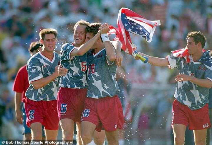
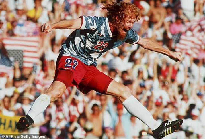
1. USA - 1994 World Cup
The 1990s were the peak of football kit design, when it seemed there was nowhere suppliers wouldn’t go in a bid to create a louder and more outrageous football strip. The 1994 World Cup may have been the decade’s greatest example of that trend and leading the way was a kit that not only personified the 90s zeitgeist, but also fully embraced the host nation like no other design had before or has since. Step forward, USA’s away strip for the '94 World Cup in the States.
The World Cup was America’s latest – and most serious – foray into making ‘soccer’ a credible sport in the country, therefore a lot of stock was put into ensuring the tournament was a success, not least the national team. To aid their quest in creating a World Cup fever, the squad were given a kit that fuelled their patriotism and showed the world how much it meant for America to be hosting the tournament.
The home shirt was an eye-catching, slightly wobbly red and white number, giving a nod to the stripes seen on the American flag. However, the away kit blew all other designs out of the water. Again taking inspiration from Old Glory, the jersey featured the country's famous stars sprawled all over the shirt, but instead of a simple blue background adidas changed the game with a faux denim base to fully embrace that ‘real American’.
The design came with its detractors, including a few members of the squad, but it played its part in a successful World Cup both on and off the pitch for the USA. The team progressed from the group stages and gave Brazil a scare in the last 16 before the eventual winners squeezed past them, while the tournament did its job in being the grounding for the MLS - which has thrived ever since. However, the lasting memory will be of the kit of all World Cup kits, when USA found a way to make fake denim seem fashionable.
Honourable mentions…
England 1966
Brazil 1994
England 1982
Cameroon 1990
Argentina 1986